


Onboarding Architecture Redesign
Company: Invest Clearly
The Challenge:
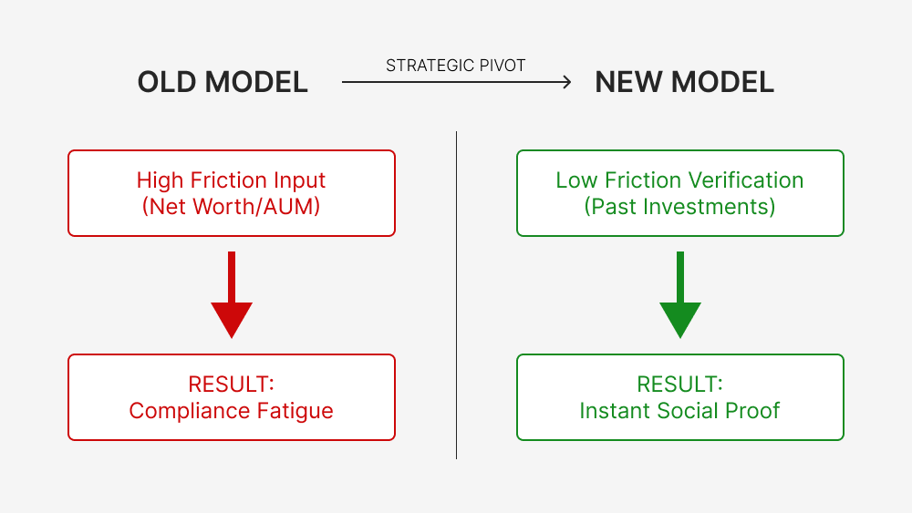
Invest Clearly, an alternative investment platform, faced a critical bottleneck in their onboarding flow. The existing model suffered from the "Give Before You Get" problem: it asked high-net-worth users for sensitive financial criteria (AUM, deal preferences) before establishing platform trust.
The Diagnostic:
The flow felt like a "compliance interrogation" rather than a utility. Users were abandoning the process because the "cost" of data entry outweighed the perceived value.
The Solution:
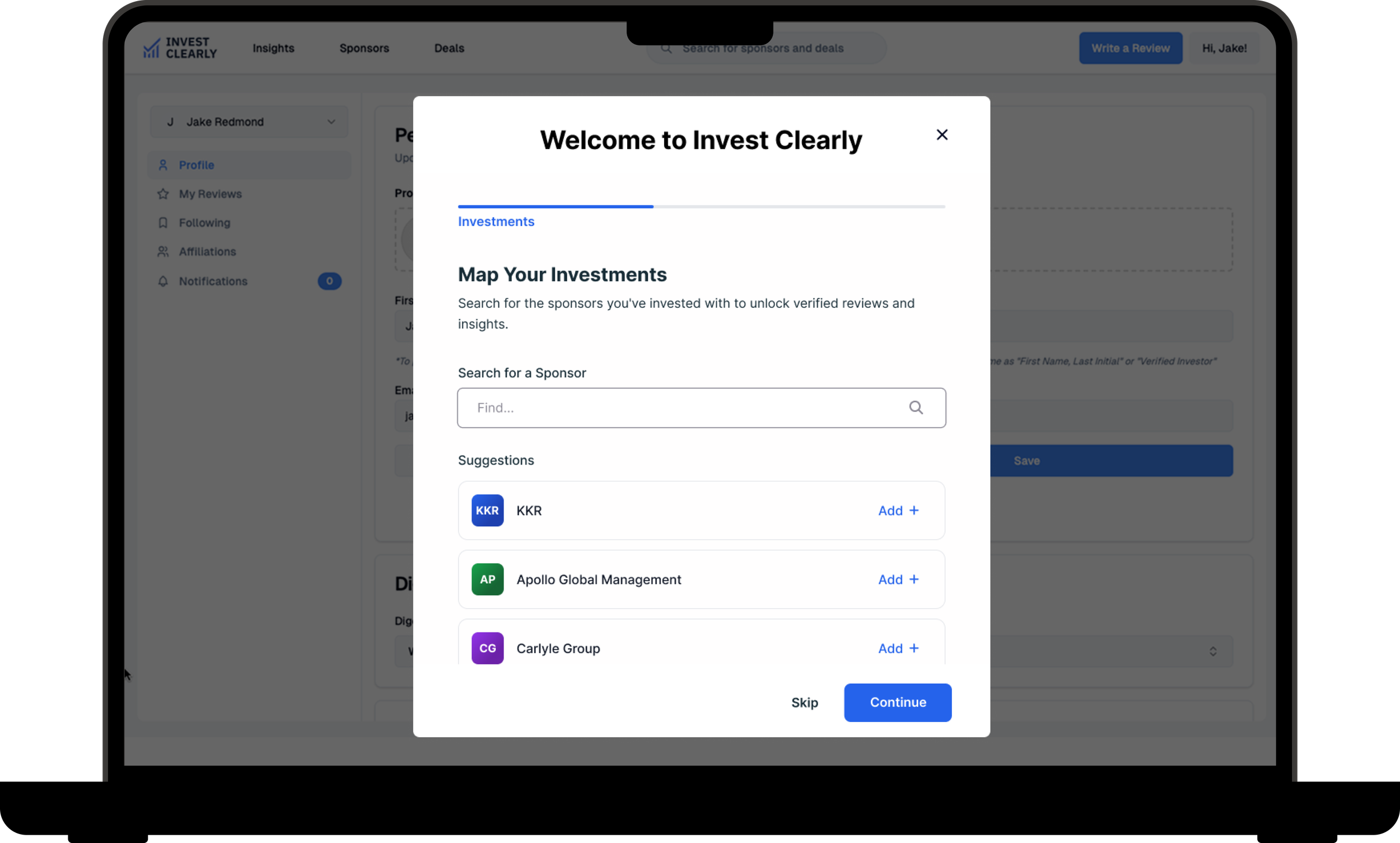
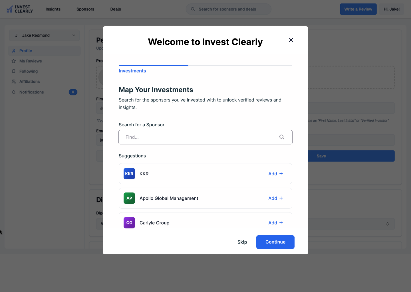
We executed a strategic pivot from Abstract Preferences (what users might do) to Verifiable Relationships (what users have done). By mapping the network of Investors (LPs) to Sponsors (GPs), we turned the onboarding friction into the platform's primary data engine.
-
Senior Product Design Partner & Systems Architect
-
UX Strategy
Information Architecture
Interface Design
-
Gemini (Strategic Synthesis): Used as a Red Team analyst to stress-test the PRD and synthesize market patterns, identifying the critical pivot from preferences to relationships.
UX Pilot (Rapid Prototyping): Deployed for text-to-wireframe iterations, allowing us to validate the interaction logic and edge cases before opening design software.
Figma (High-Fidelity): Reserved strictly for final execution, translating the verified logic into a production-ready trust system with polished UI assets.
-
Shifting from "Preference Collection" to "Relationship Mapping"
The Logic Audit
The primary reason for the high bounce rate was a mismatch between user psychology and system requirements.
The "Give Before You Get" Failure
The original architecture relied on hypothetical data. It asked users to define their future investment behavior immediately upon entry. In the high-stakes world of alternative investments, users are naturally reluctant to share financial criteria with an unproven platform.
The "Blue Ocean" Insight
We used AI to synthesize patterns from two competing markets to find the gap:
Investment SaaS: High compliance, document-heavy, slow.
Review Platforms (e.g., G2): Low friction, viral, low trust.
The Strategic Gap:
We positioned Invest Clearly in the middle. We avoided the heavy compliance flow of SaaS (too slow for growth) and the loose flow of generic reviews (too low-trust for finance). The solution was Relationship Mapping—using past behavior to verify future intent.
We validated the logic before committing to high-fidelity pixels. This ensured we weren't just making a broken system look "pretty."
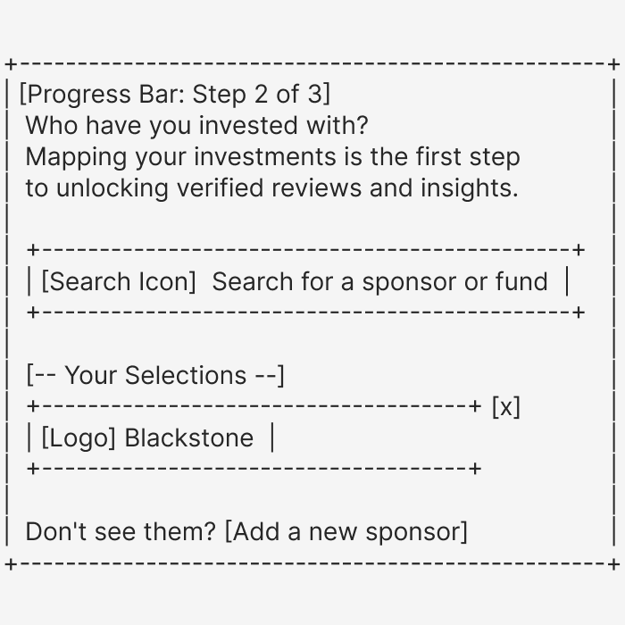
Text-Based Wireframing (AI Workflow)
We utilized LLMs to generate ASCII-based layouts to test the information architecture. This allowed us to strip away visual distractions and validate the "Search + Add" logic instantly.
By prototyping in text first, we identified a critical edge case: 'What happens if a user doesn't see their sponsor?'. This allowed us to design the 'Add-a-GP' flow before opening Figma.
The Architecture (Logic Before Pixels)
The Design System & "Trust Tuning"
Once the logic was validated, we moved to high fidelity. We utilized a "Prompt-to-UI" workflow to generate the initial visual foundation. Instead of starting from a blank canvas, we encoded the design system directly into the prompt to ensure the AI output was structurally sound.
The AI Specification
We defined the constraints (hex codes, layout structure, and content hierarchy) in the prompt to force the AI to adhere to our Trust Framework.
Why this matters: By defining the CSS-level attributes (hex codes, shadows) and the business logic (edge cases) in the prompt, we minimized design hallucinations. We moved straight to a usable UI foundation that respected the system architecture.
// SYSTEM INSTRUCTIONS:Create a 3-screen wireframe flow based on the following logic.// 1. GLOBAL STYLES (The "Trust" Palette)Color Palette: Primary Blue (#3E84F4), Dark Text (#172C36), Background (#F1F5F9).Layout: All content must exist within a single, centered white card with soft shadow.Header: Persistent top nav with "INVEST CLEARLY" logo and "Write a Review" button.// 2. SCREEN LOGICScreen 2: LP Flow - GP Selector (The Core Value)- Goal: Map LP-to-GP relationships.- Progress Bar: "Step 1: Role" complete -> "Step 2: Map Investments" active.- Search: Full-width bar with placeholder "Search for a sponsor or fund..."- Logic A (Selections): Show selected items as cards with logos (e.g., Blackstone [x]).- Logic B (Edge Case): Include link text "Don't see them? Add a new sponsor."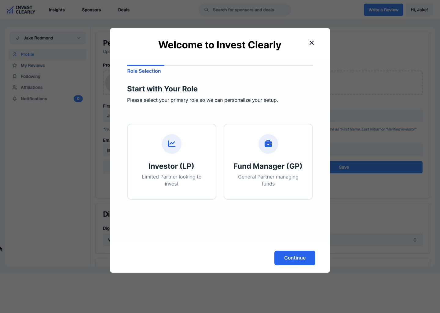
Trust-Centered Copywriting
In high-stakes fintech, copy is not just content—it is the primary interface for risk management. We analyzed every instruction using a "Trust Framework" (Transparency, Predictability, Control) to reduce abandonment anxiety.
We didn't just write instructions; we "tuned" the language to answer the user's subconscious question: "Is this safe?"
The Predictability Tuning
We found that users hesitated at the verification step because the scope of work was unclear.
Draft: "Verify your affiliation to respond to reviews."
Critique: Vague. Sounds like a long legal process. Triggers compliance fatigue.
Shipped: "Verify your affiliation. This is a secure, one-time process."
The Shift: We added Predictability. By defining the effort ("one-time") and the safety ("secure"), we removed the fear of the unknown.
The Transparency Microcopy
In the GP Selector flow, users are mapping their private financial history. We had to explicitly address the fear of exposure.
The Context: Users search for sponsors they have invested with.
The Microcopy: "This information is confidential and never shared publicly".
The Shift: We placed this right next to the input field. This adheres to the transparency principle, preemptively answering the objection before the user can churn.
The Control Signal
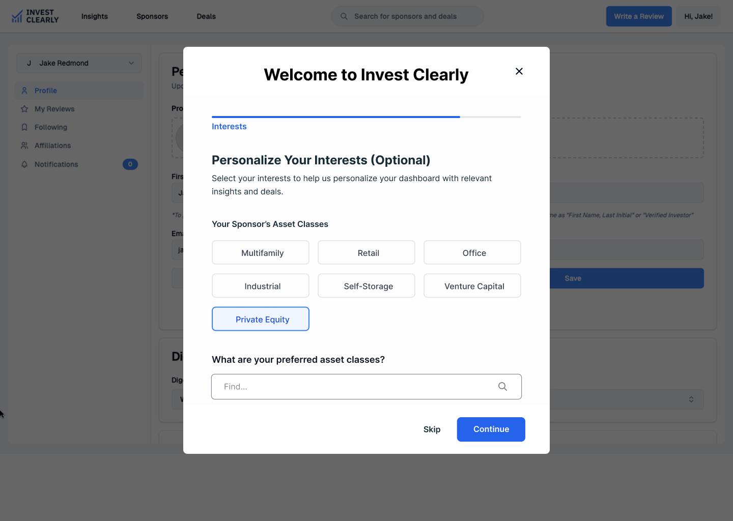
For the Interest Collection step, we needed data but couldn't afford to block the user.
The Copy: "Personalize Your Interests (Optional)".
The Shift: Marking the step as explicitly optional gives the user control. Paradoxically, giving users the power to skip often increases completion rates because they no longer feel trapped.
The User Flows
We designed these paths to prioritize speed to value over administrative completeness.
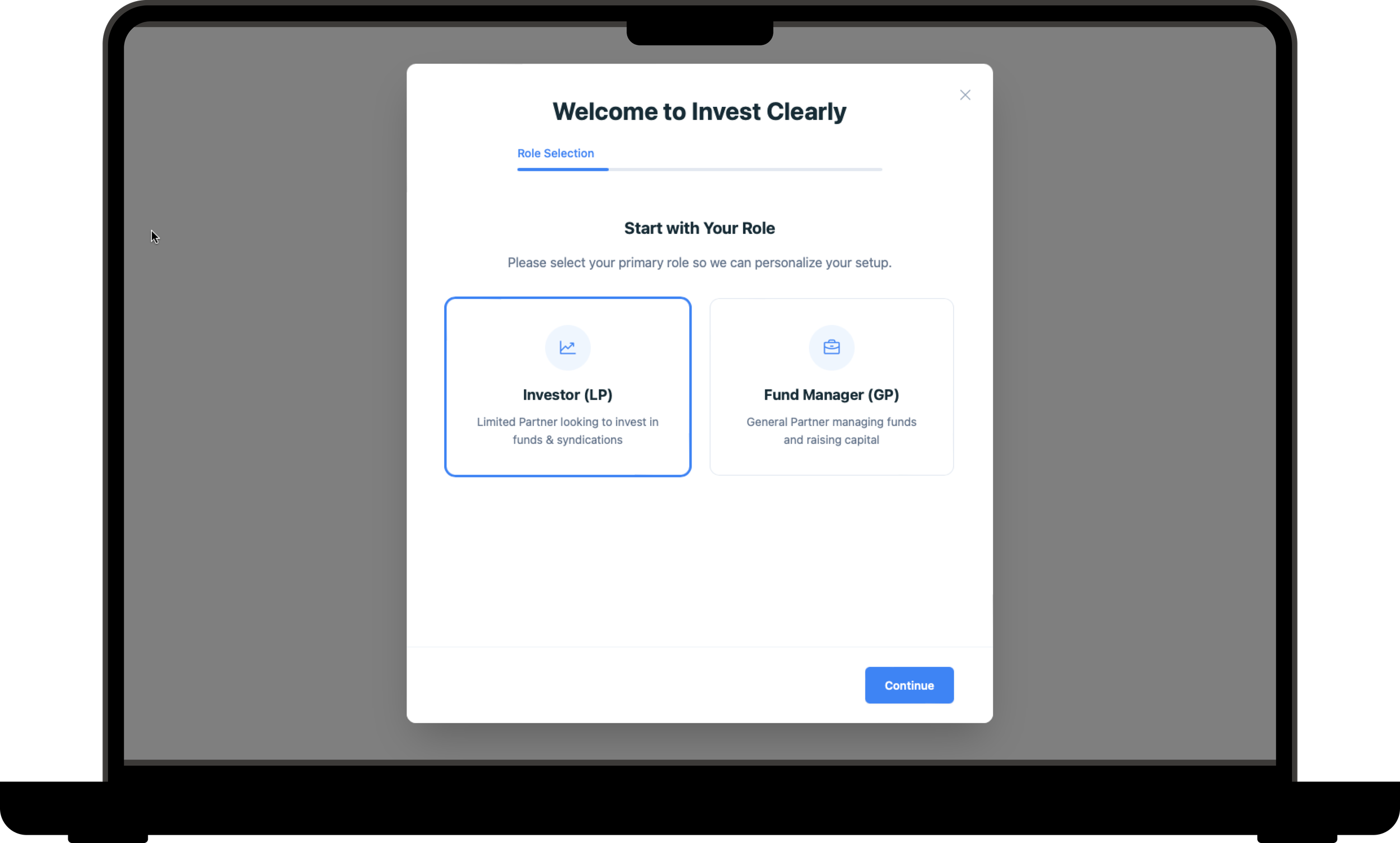
Flow 1: The Investor (LP) Path [Mapping Relationships]
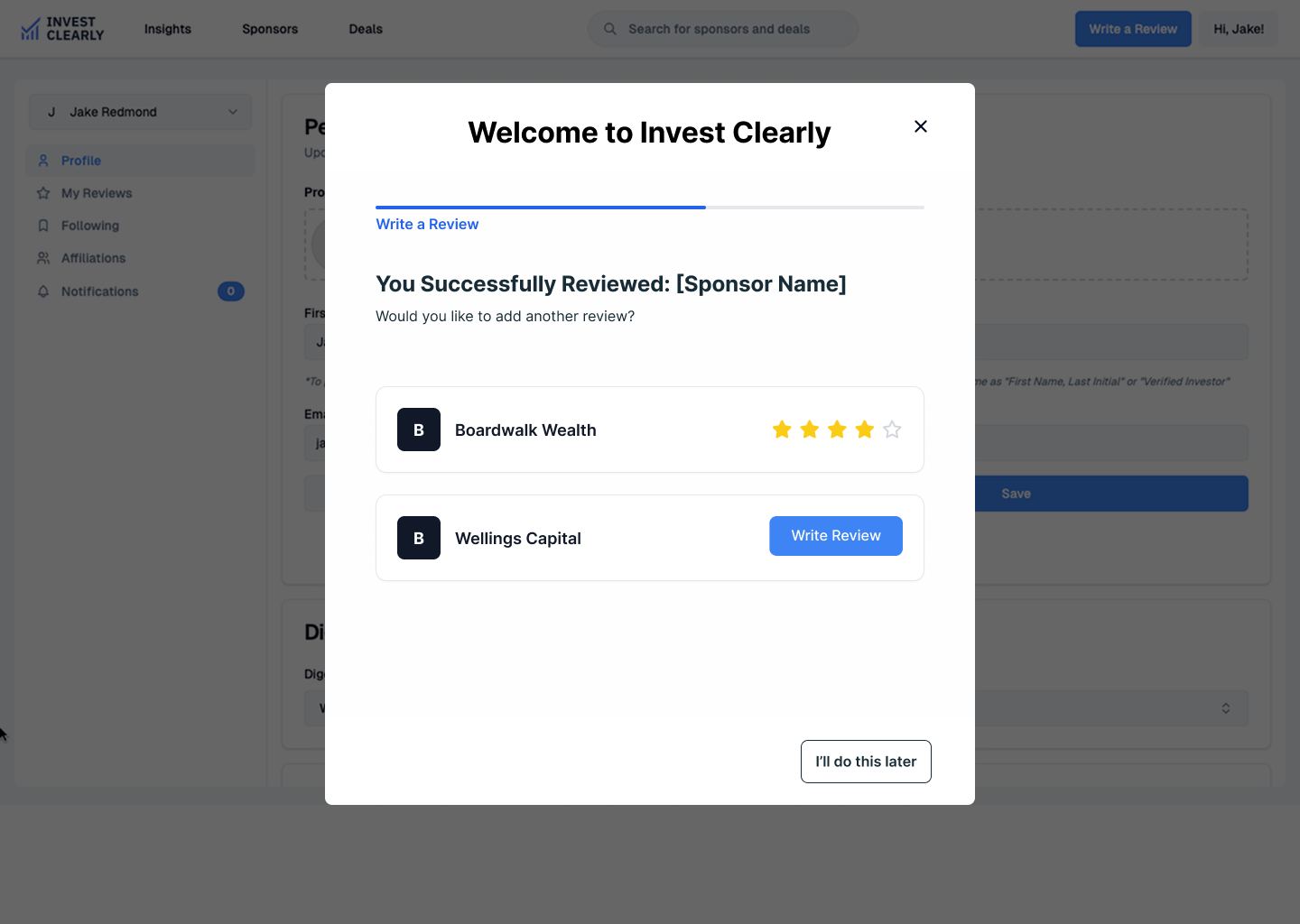
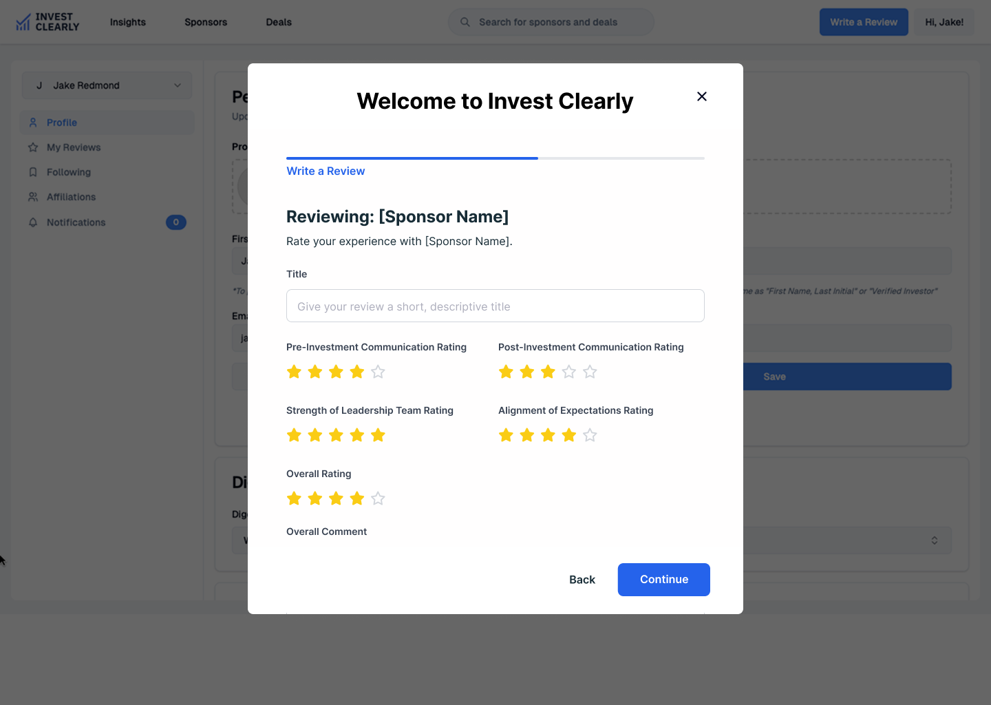
Logic: Role Selection (Front Door) ⇨ GP Selector (The "Magic Moment") ⇨ Immediate Review Prompt ⇨ Interest Collection (Optional/Skippable).
The Win: We capitalize on high-intent context. If a user says they know Blackstone, we immediately ask, "How was your experience?"
Flow 2: The Fund Manager (GP) Path [Supply Growth]
Logic: Search Firm ⇨ Claim Profile ⇨ Verification Loop ⇨ Dual-Role Transition.
The Win: The "Dual-Role" logic acknowledges that most Fund Managers are also investors themselves, automatically inviting them to map their personal portfolio to maximize User Lifetime Value (LTV).
Flow 3: The Direct Link Path [Friction Reduction]
Logic: Inbound Email Link ⇨ Review Form (First) ⇨ Auth (Second) ⇨ Backfill Data.
The Win: We reversed the standard order. By putting the "Review" before the "Profile Setup," we capture the data point while motivation is highest.
The Build: Functional HTML Prototype
We believe that static mocks often hide interaction flaws. As a final deliverable, we moved beyond Figma to deliver a functional HTML prototype built with Google Stitch.
The Artifact: A click-through browser-based model of the onboarding flow.
The Purpose: This allowed the engineering team to inspect the responsiveness of the GP Selector modal and the logic of the Progress Bar states without having to interpret static redlines. It bridged the gap between Design and Engineering, ensuring the Trust Tuning survived implementation.
Conclusion: From "Data-Hungry" to "Relationship-First"
By leveraging AI for rapid logic validation and strategic synthesis, we compressed the design timeline and ensured every interaction was grounded in psychological trust principles.
We successfully transformed the system model:
From: A high-friction Compliance Interrogation (asking for Net Worth/AUM).
To: A low-friction Relationship Map (verifying past partners).
The result is a streamlined onboarding flow that prioritizes high-value data (relationships) over low-value data (preferences), positioning Invest Clearly as a verified source of truth in the alternative investment market.