


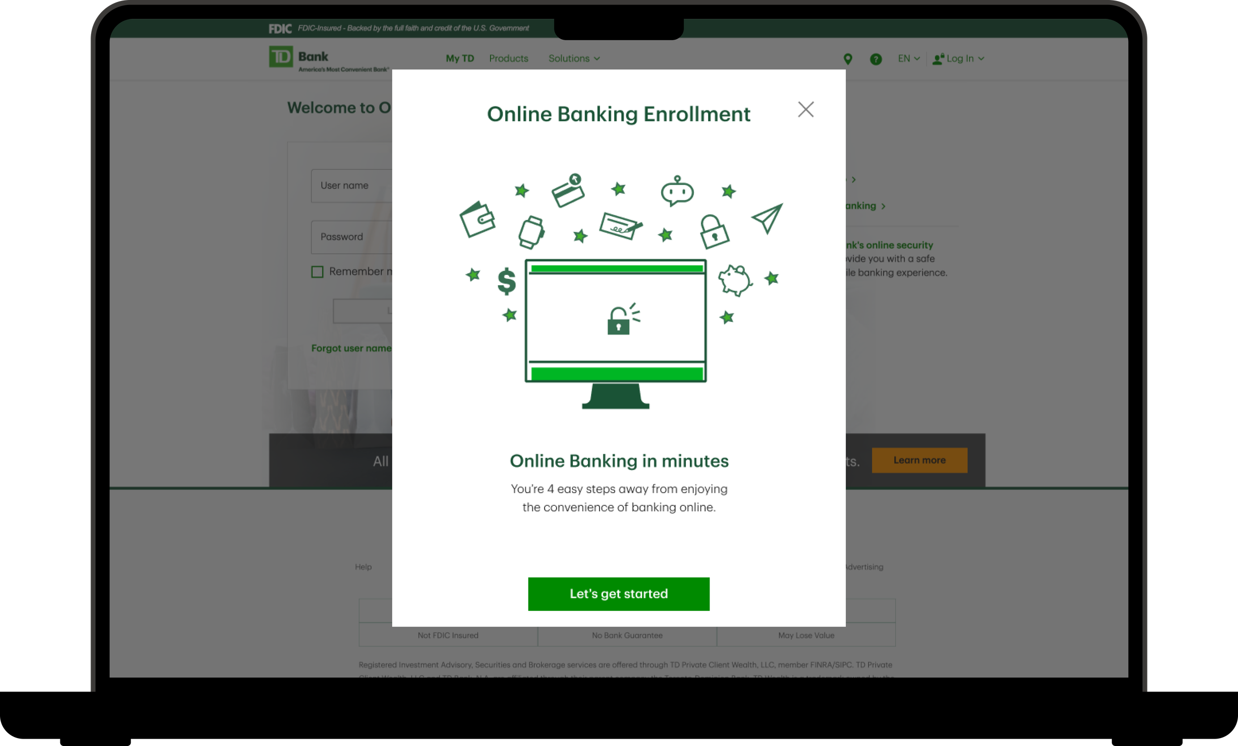
Online Banking Enrollment Redesign
Company: TD Bank

TD Bank, a Canadian multinational banking and financial services corporation, was looking to reimagine their Online Banking enrollment experience for customers. I was brought on to lead the redesign for the responsive web side of the project.
The Problem
Enrollment in Online Banking for existing customers was underperforming. If the bank could hit the industry average, it had the opportunity to add ~700,000 new Online Banking customers. The existing experience had a significant drop-off in the enrollment process as customers hit roadblocks and exited the experience, contacted the call center, or visited a store to complete their enrollment.
-
As Manager of User Experience Deign for the Responsive Web Online Banking team, I led the design of the UX and UI for the for the project.
-
Brainstorming
Wireframing
User Flows
User Testing
Prototyping
-
Product Owner
Product Manager
Business Analyst
Architect
Mobile Design Team
User Research Team

The Problem
While enrollment for new to bank customers was performing above the industry average, enrollment in Online Banking for existing customers was underperforming. If the bank could hit the industry average, it had the opportunity to add ~700,000 new Online Banking customers. The existing experience had a significant drop-off in the enrollment process as customers hit roadblocks and exited the experience, contacted the call center, or visited a store to complete their enrollment.
The success rate for both self-guided and assisted enrollment was between 4-9%, with increased call center volume and store visits.
What Customers Were Saying
“Opening an account was fine but unfortunately it goes sour when trying to enroll for online access.”
— TD Customer
“If you are willing to send a debit card out, at least have the decency to give me the opportunity to have an online banking account to manage it. I really like TD Bank, and would like to have it as my main bank. It’s sad no one seems to care if I need assistance to enroll into online baking.”
— TD Customer
“It would be easier if new customers could signup for online banking right away without having to put their debit card number in, seeing how we have not received a debit card yet; and we have to wait two weeks to receive it.”
— TD Customer
“I have been trying to enroll in online banking for over a week now and have spent countless hours on hold and getting transferred. I am still not enrolled and nobody is able to help me.”
— TD Customer
The Solution


Project Details
Project Kick-off
In order to solve these customer complaints and bring TD’s Online Banking enrollment up to industry average, the entire enrollment flow was re-imagined. The project kicked off with a design sprint, bringing the Human-Centered Design team together with the line of business, change managers, legal partners, and the product team. At the end of the design sprint, the team ran a round of user interviews, testing a prototype they built, to gain user insight into the new process. Armed with this information, the project was then handed to the project teams to design the experience for each specific platform.
Goals for the Project
Breakup the enrollment form into manageable steps
Simplify the information the user needs to input
Consolidate Terms & Conditions
Streamline the OTP Security verification
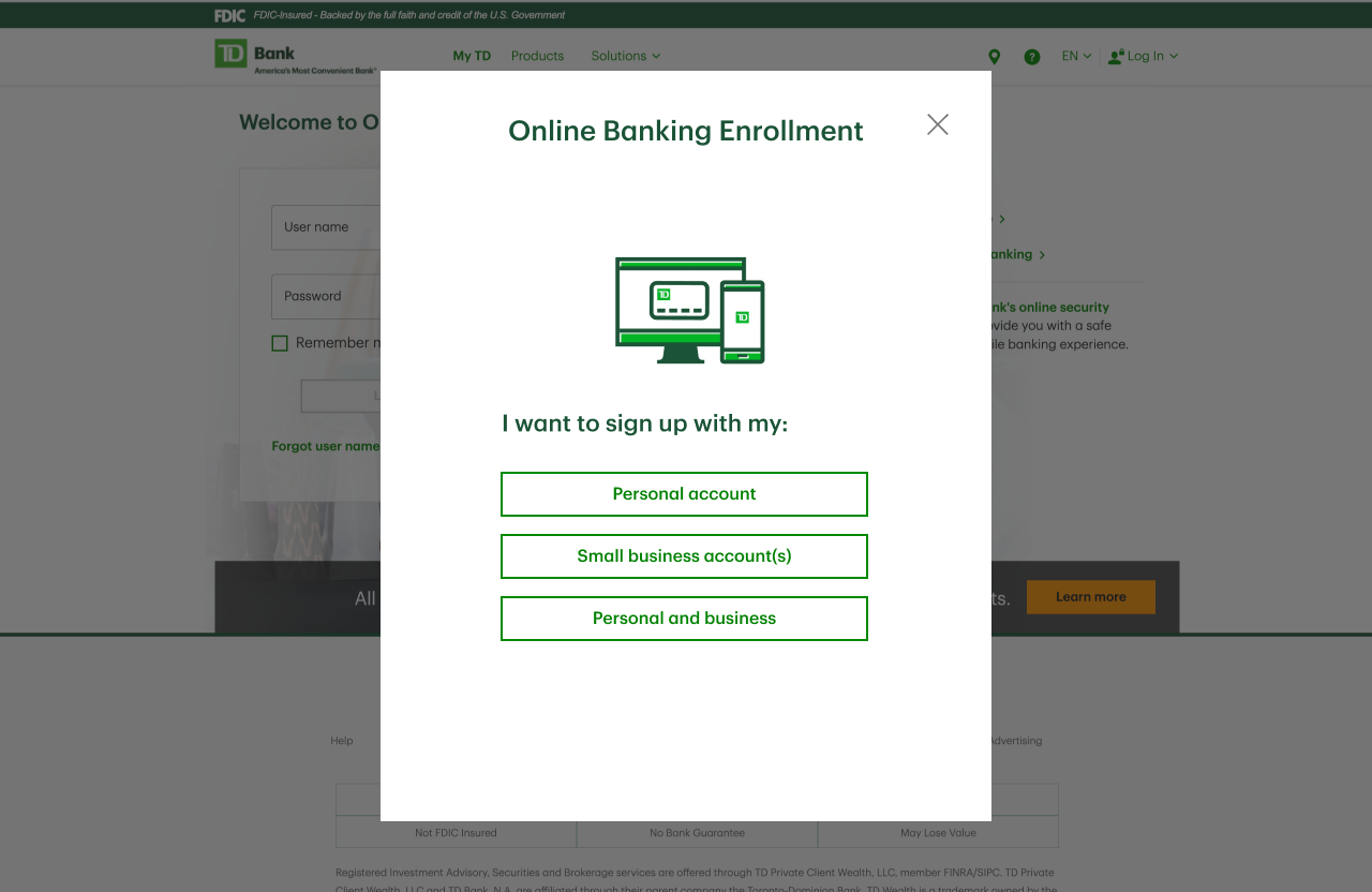
After the design sprint was complete, the project was handed over to my team to begin the design for our Responsive Web platform. Our first focus was to sort out the stepped process that came out of the design sprint, adapting it to fit our platform and standards. The new enrollment flow was broken down into 4 easy steps:
Account Lookup
Terms & Conditions
Security Verification
Username & Password Setup

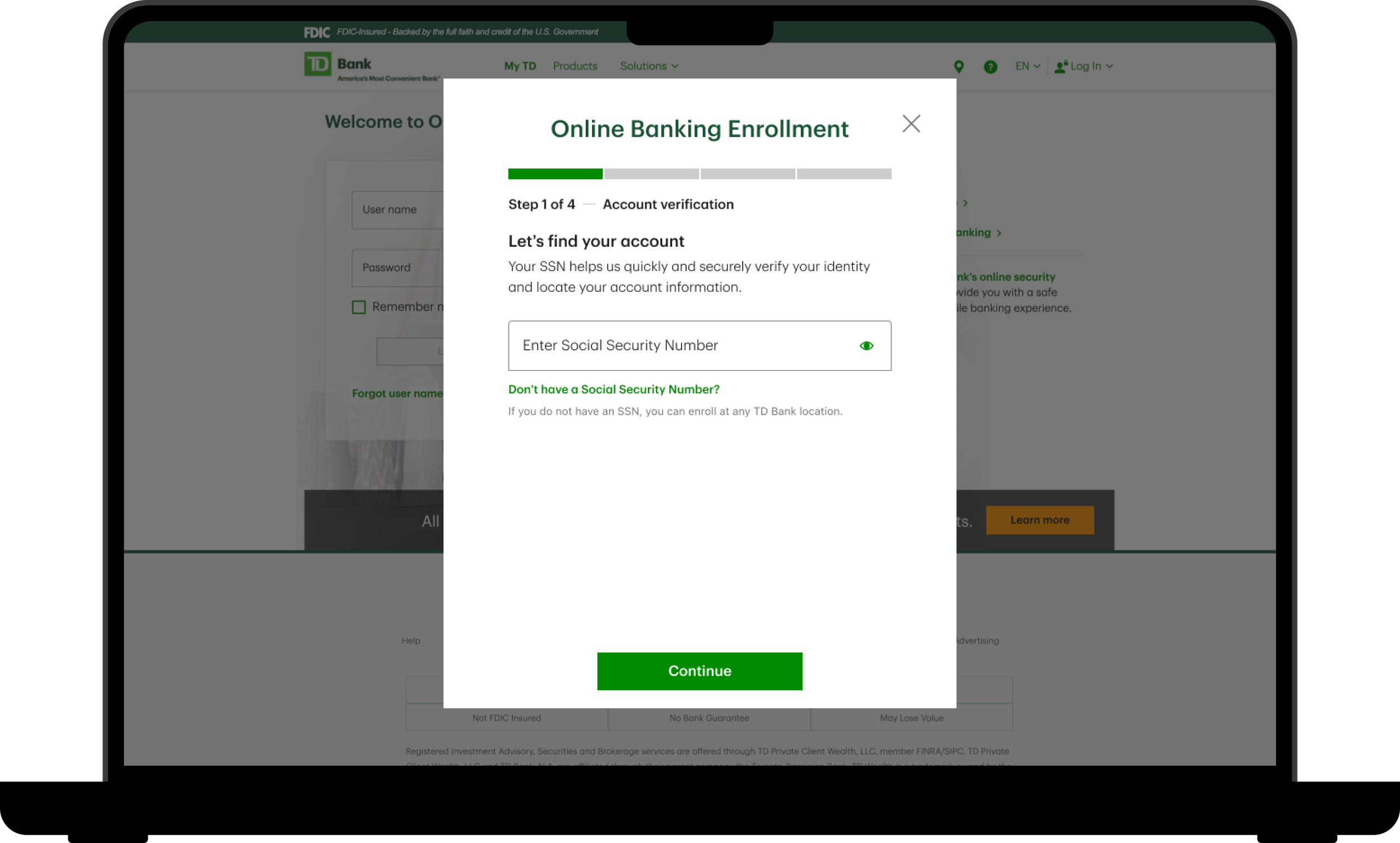
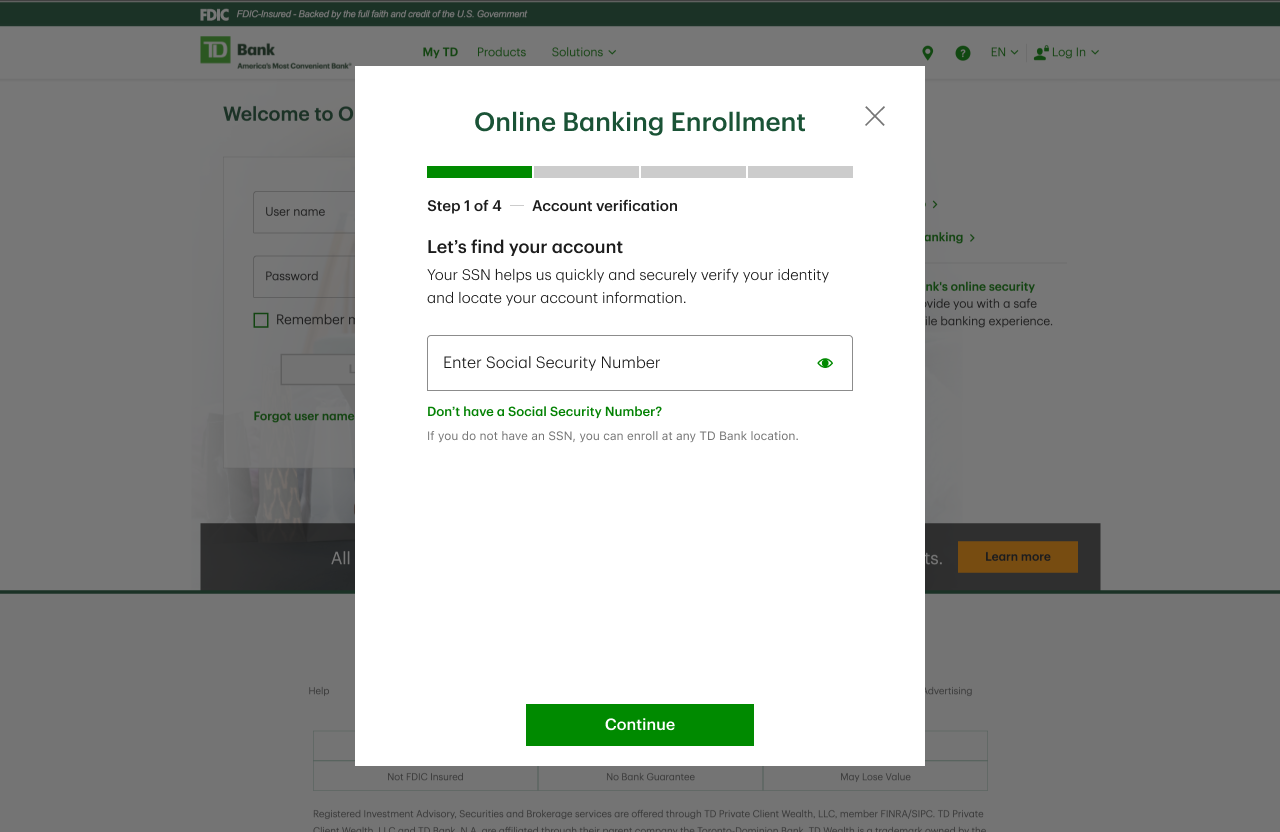
Account Lookup
Finding the users’ correct accounts is arguably the most important step in this whole process. Not only did we need to ensure that we were bringing up the users’ correct information, as well as consider fraud concerns, but this was also the point where there was the largest user drop-off in the old flow.
During the design sprint, the team decided to use only a user’s Social Security Number to lookup a users’ accounts. This greatly simplified the inputs for the user but also had mixed results during user testing.
“ I do not want that to be the first thing they ask me.”
The user tests revealed that users were hesitant to input their Social Security Number, although all shared they would expect the bank to ask for it.
Several users shared that they would be more comfortable sharing a combination of their DOB and SSN or Account Number.
Second Round of User Testing
To determine the correct combination of inputs to ask for, we decided that a second round of user testing was needed. We wanted to keep the flow as simple as possible and decided to test one version that just asked for a users’ Social Security Number vs. a version that asked for Last Name and Social Security Number.
Working with the User Research team, we set up an unmoderated user test to test the entire flow again. Within this test, we put an A/B test on the account lookup screen.

Research Outcomes
All users were willing to share their Social Security Number
50% of users were curious if they could use other verification methods
Users stated they would like to see some help or alternative ID options
16.6% of users expected a confirmation from the bank confirming the correct information was found
20% of users shared they would like to see more information on how the bank is using their information and how their privacy is being protected
Armed with these new insights, we had the data we needed to make informed design decisions.
Social Security Number as the only user input
While users in both tests initially expressed concern or alarm that they were only asked for their Social Security Number, no one said it would prevent them from continuing with the flow since they would expect a bank would need their Social Security Number.
During the A/B test, users presented with the Last Name and Social Security Number version, expressed the same type of alarm. The research did not support that asking for more information alleviated users’ concern.
Content Design refinement
In testing users stated that they would like more information on how the bank was using their information and keeping their information private. Working with the Content Design team, we reworked the language on the screen to make it clear to they user why the bank was asking for their information
Let’s verify you → Let’s find your account
For security reasons we need to verify it’s you → Your SSN helps us quickly and accurately verify your identity and locate your account information.
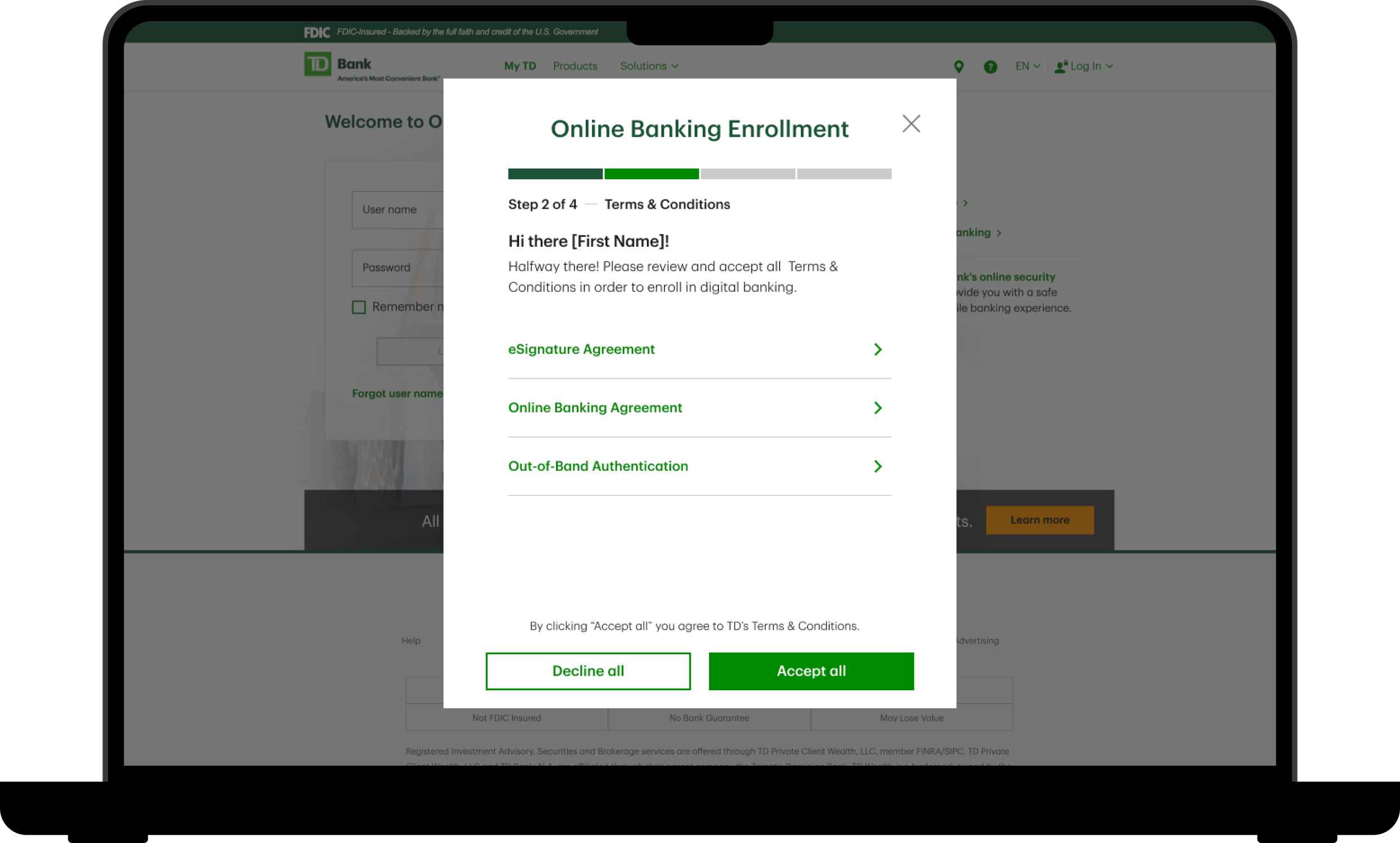
2. Terms & Conditions
After account information is found, the user is presented with the Terms & Conditions required for Online Banking enrollment. In the previous flow, Terms & Conditions were presented contextually. While in theory this makes sense, in practice it meant that there were multiple points within the old flow were the user had to agree to Terms & Conditions.
In the new flow, all Terms & Conditions were consolidated into a single screen. Because all of these agreements must be agreed to in order to complete the flow, we provided a single button for the user to accept all the agreements at once. This reduced users’ cognitive load and lowered the steps required to complete the flow.
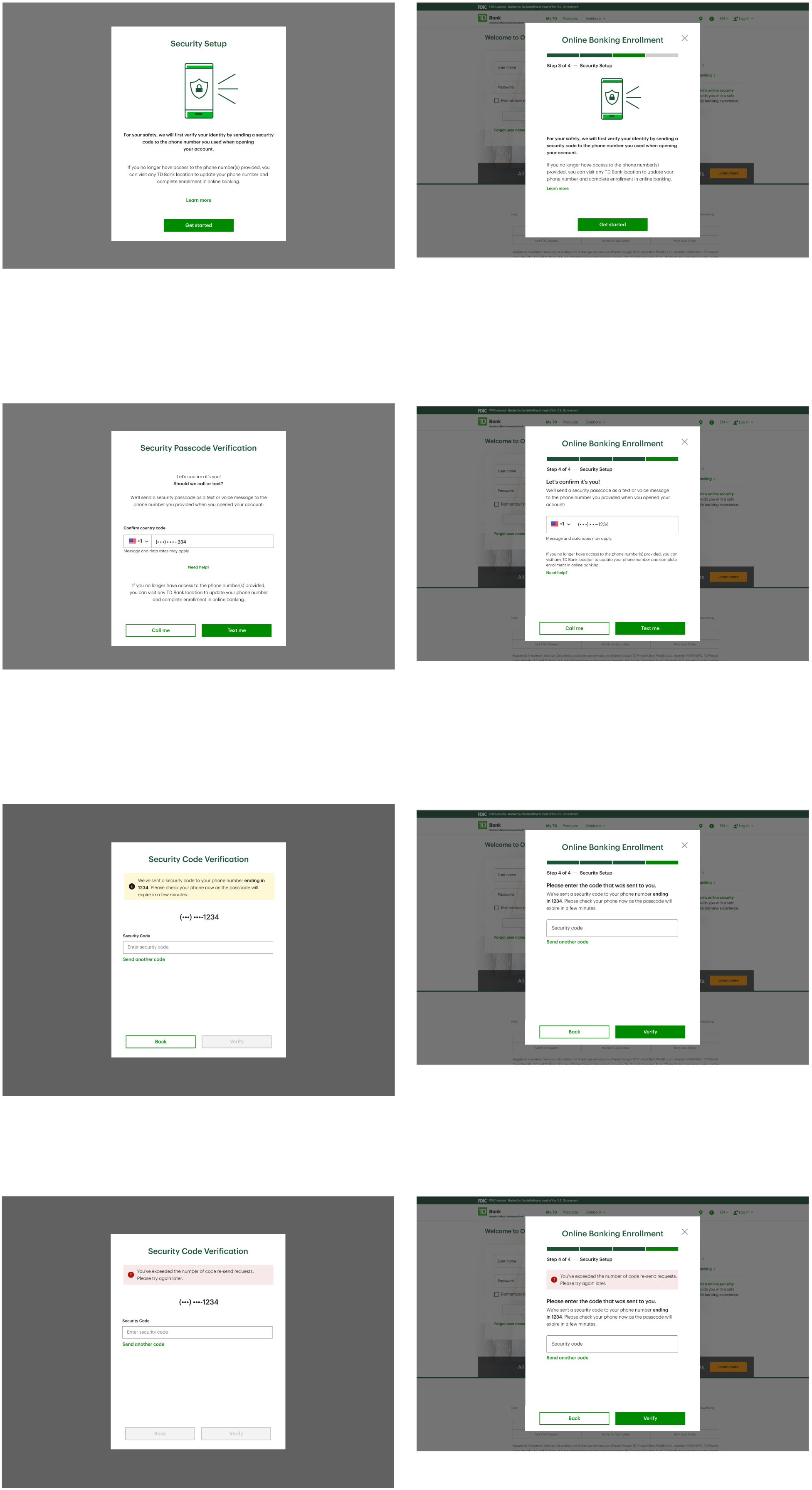
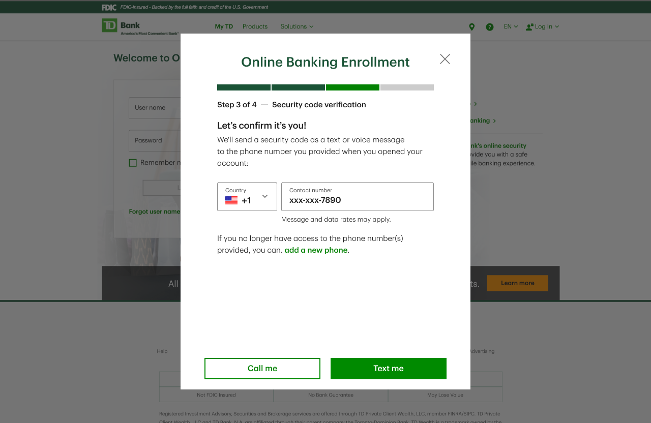
3. Security Verification
After the user has accepted all Terms & Conditions, they are taken to step 3 of the enrollment process, Security Code Verification. Initially, this step caused the greatest concern for me as a designer. It was obvious that the design of these screens needed to match the rest of the enrollment flow. However, the development team had just completed a major overhaul of these same screens as a part of another project. My fear was that the development team would resist changes to these screens after just completing this previous project.
Once our initial designs for the enrollment flow were finished, I held design review sessions, first with the greater Human-Centered Design team and then with a group of Product Owners, to discuss the potential changes, discover any pitfalls, and come to a consensus on the best path forward. These sessions were essential for aligning the various teams and building goodwill with our project partners.
In the end, the architecture team decided to separate out the enrollment flow verification from the other security verifications on the platform. Because of that decision, we were free to design the enrollment flow screens without fear of affecting other screens across the site.


4. Username & Password
The final step of the process requires the user to input a username and password for their new account. This step was straight-forward but necessary for setting up the account correctly. There was a discussion during the design sprint to auto-fill the username field with the user’s email address on file to reduce the number of inputs. As we got further into the design process, there was concern that special characters in email addresses would not store correctly in the database. Additionally, we decided to give users control by selecting their username and password for themselves.
Design System Component Implementation
This flow was focused on converting a long and frustrating form into a simplified experience that walks users through one step at a time. Because of the nature of the flow, I felt it was necessary to display a progress bar alerting the user to where they were at in the flow.
Luckily, although we did not have such a component in production, TD Bank had recently updated their design system and there was such a component in the design system. The only issue was that the responsive web platform had not yet adopted the new design system as the code-base needed to update versions of Angular.
Because we felt the progress bar was essential for the design, we approached our product and development partners about using the new design system component to as a one-off to complete the design.
I called a meeting and presented my reasoning for needing the new component, as well as design options if we were not able to use the component. The Development leads agreed to look into the feasibility.
They determined that it would take approximately one developer, one sprints worth of work to implement the new component. We then met with the product team, presenting the reasoning and research. They agreed to take on the extra work to implement the component into the project.
Conclusion
By the end of this project, we had designed a simple, easy to understand enrollment experience. Armed with this new flow, TD Bank is poised to reduce customer complaints and to bring its new Online Banking enrollments above industry average.
The new experience does this by:
Breaking up the flow into manageable steps
Simplifying user inputs
Consolidating Terms & Conditions
Streamlining the OTP Security verification